
Study Space
Overview
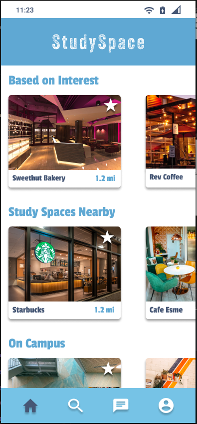
Study Space is a mobile app prototype primarily focused to help students find locations to study in their community.
This was created to address a problem that certain services such as Meetup, Google Maps or Yelp could not solve. We focus on the more academic side of the community and bring them together to collaborate and explore new options.
Role
Product Designer
User Research, Interaction, Visual Design, Prototyping & Testing

The initial focus for StudySpace was on helping students find new places to study in their community, connect them with the like-minded people and groups int heir community, and create a more effective study experience. While Meetup, Google Maps and Yelp address some of these issues, they fails to address some of the students individual needs because of their general target audience. Our product will address this gap by creating an app where students can search for locations with relevant suggestions and filters and also chat and create study groups.
Understanding the Problem
We decided as a product to identify key business goals:
We want the users to have the ability to locate study groups or a community that encourages academia
We want the users to feel like our product provides accurate data about the locations and community
Competitive Audit
As a starting point, we each looked at articles with the purpose of conducting proper research in order to understand the market, user needs, similar apps, local cafes and possible features for our app. Within the research we found a few competitors that could better help us understand our future product. We kept the number to three competitors and assessed the pros and cons for each one.
Product Vision and Solution

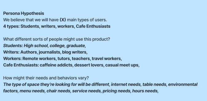
Persona Hypothesis
We proceeded to figure out whom our ideal interviewees would be by first hypothesizing a persona. Based on our previous problems, vision and solutions we had the initial idea of the main type of users. Then, as a group we created a set of questions to help get started with the persona. Based on the four types of users found, we narrowed down even further on what sort of people they might be.
Interviews
We created a set of questions that would help us understand the general consensus on the idea for out StudySpace app and take a look at who these users were.
Each interview required insight from each member. We had individual slots for everyone to write down and valuable feedback that caught their attention and ideas that could work or wouldn’t work. At the end of all of our interviews we had a final meeting to combine all of the ideas that correlated from each individual interviewee, this way we could narrow down any possible features, likes, dislikes, motivations and more.

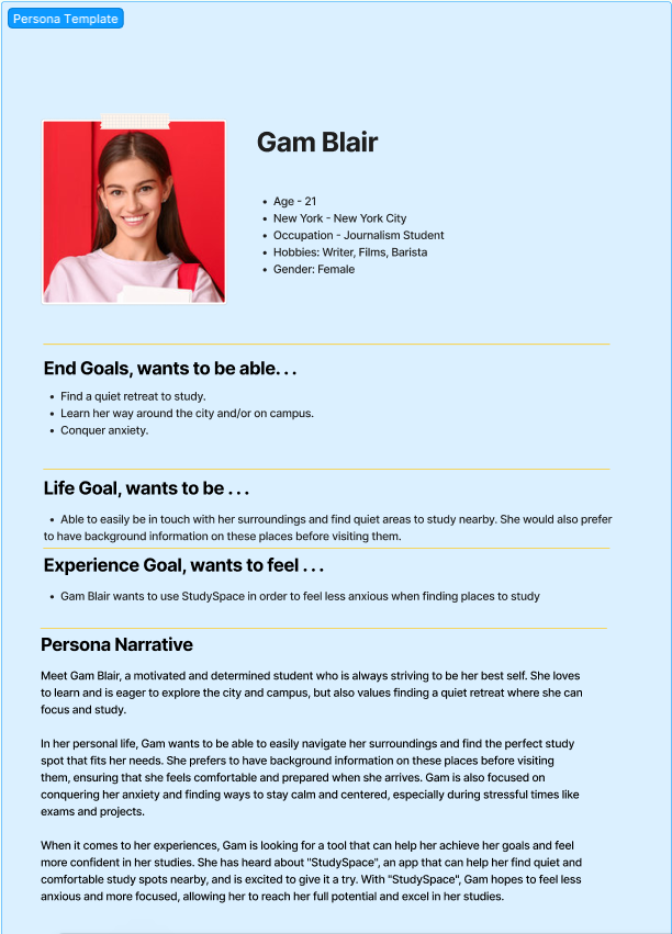
Visualized Personas
After interviews we mover on to the final stage of creating our persona. We decided to create two personas. A primary based on the largest data cluster and a secondary, using supplemental data.
We came to the conclusion that our users will be someone relatively young in their adult stage.

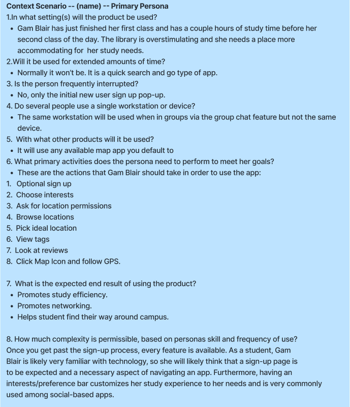
Context Scenarios
Following the persona creation we proceeded to create context scenarios showing how the product fits into the persona’s life and how it helps them achieve their goals. We kept it as a 1 to 2 page narrative focused ion their high-level interaction with our product. This helps us with extracting design requirements
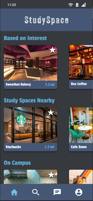
Wireframing
As we began our wireframing we had a requirement list for our priority pages. We wanted to focus more on the community aspect so the initial pages were the Direct Message and group screens. From there we focused on the map and information screens. Lastly, we finalized with the profile page, the sign in and sign up screens


Prototyping
One of our initial ideas was to incorporate a light and dark mode for the user. Based on many of our interviewees feedback we had reasonable amount of data backing up the idea that a dark mode would be beneficial for the overall project. We took a simple approach to the colors by keeping the main text header color as it contrasted well in both light an dark backgrounds, and altered the card text to a lighter color.
In Summary
Lean UX looks complicated at first but once you get to understand how it works, it really allows you to get a lot of work done without wasting time and because of this, I feel like we were efficient in most of our sprints. Lean UX sprints go by fast and you require a lot of communication from your team members. I appreciate the effort my team put into consistently showing up for our meeting and communicating effectively.
Some things I would love to do differently are our early stages of wireframing. Most of my work felt too high fidelity and all of our teams work lacked organization and consistency. I feel like most of our interviewees struggled to understanding the idea at first because it felt like various individual designs trying to be one thing. I am however thankful we managed to correct this on sprint 2.
If we had more time to work on this project I would love to do one more round of interviews with our earlier candidates and use one more week to refine our prototypes. I think some of the map elements could have use some color adjustments and more interactivity.